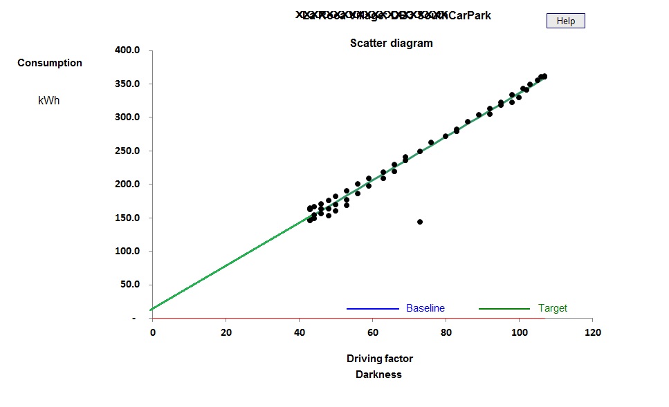
The diagram below shows the relationship, over the past year, between weekly electricity consumption and the number of hours of darkness per week for a surface car park. It is among the most consistent cases I have ever seen:

There is a single outlier (caused by meter error).
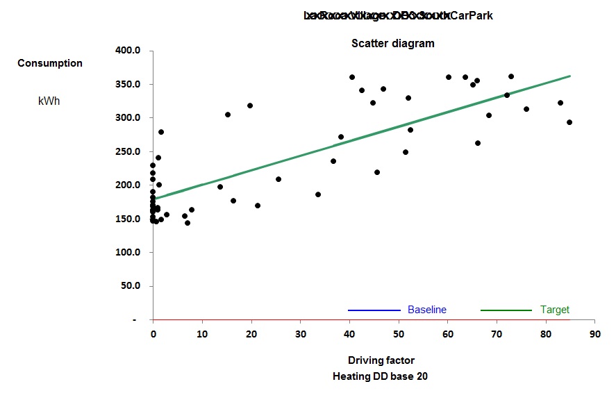
Although both low daylight availability and cold weather occur in the winter, heating degree days cannot be used as the driving factor for daylight-linked loads. Plotting the same consumption data against heating degree days gives a very poor correlation:

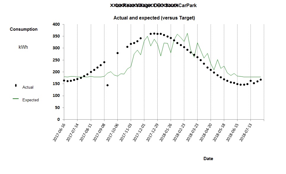
There are two reasons for the poor correlation. One is the erratic nature of the weather (compared with very regular variations in daylight availability) and the other is the phase difference of several weeks between the shortest days and the coldest weather. If we co-plot the data from Figure 2 as a time-series chart we see this illustrated perfectly. In Figure 3 the dots represent actual electricity consumption and the green trace shows what consumption was predicted by the best-fit relationship with heating degree days:

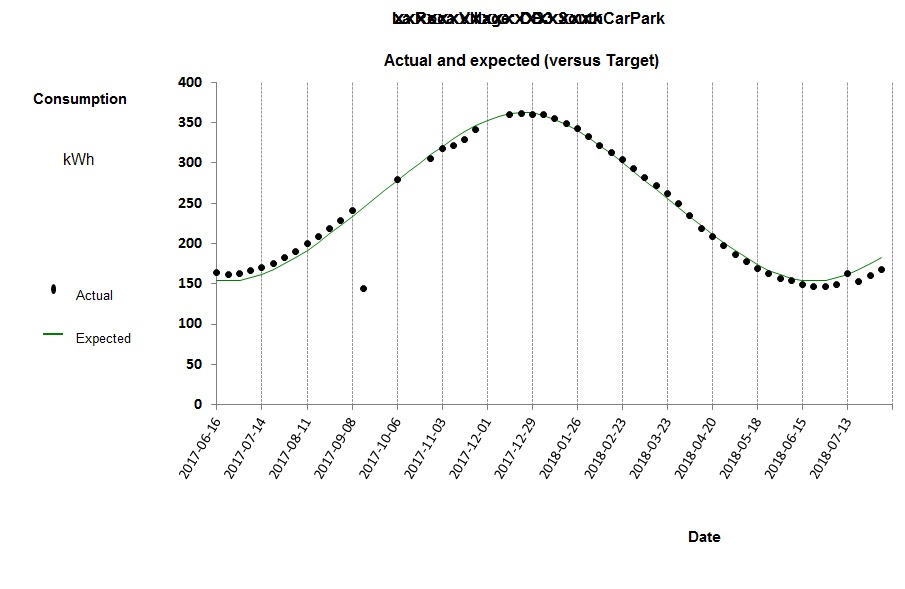
Compare Figure 3 with the daylight-linked model:

One significant finding (echoed in numerous other cases) is that it is not necessary to measure actual hours of darkness: standard weekly figures work perfectly well. It is evident that occasional overcast and variable cloud cover do not introduce perceptible levels of error. Moreover, figures for UK appear to work acceptably at other latitudes: the case examined here is in northern Spain (41°N) but used my standard darkness-hour table for 52°N.
You can download my standard weekly and monthly hours-of-darkness tables here.
This article is promoting my advanced energy monitoring and targeting workshop in Birmingham on 11 September