All posts by Editor

More choice for electricity users?

DATELINE 1 APRIL 2017: When the UK’s gas and electricity industries were opened up to competition it must have irked energy suppliers that there was nothing they could do to differentiate their product from their competitors. “The same gas through the same pipes” is about as far from a unique selling proposition as it’s possible to get; but all that is set to change in the electricity industry thanks to innovative smart-energy startup Brain Power Limited.

Some of the mains supply waveforms available from BPL

BPL’s marketing experts have taken inspiration from current trends such as voltage optimisation, variable frequency drives, and power quality monitors to create exciting new electricity supply options that they describe as “fit for the age of smart meters and artificial intelligence”. Out is the bland sine-wave alternating current (top) that has been the staple for public electricity supply in the UK for 70 years or more: “in” is a spectrum of waveforms ranging from the inexpensive square wave to the edgier sawtooth (bottom) and, for the connoisseur, designer waveforms like ‘ogive’ (second from top) which co-ordinates beautifully with Victorian architectural features. “The great thing about these non-sinusoidal waveforms is that they are really rich in higher harmonics”, said a BPL spokesman.

There will be voltage options for every taste as well. 261 volts could appeal to musicians who will appreciate a voltage that equals the frequency of middle C. Nerds may go for 256 volts (because it is a “power” of 2). Initially available in single and three-phase supply only, BPL is rumoured to be releasing five and even thirteen-phase supplies after Brexit is complete, when customers will also be able to cast off the shackles of 50 cycles per second mains frequency.

Asked whether their catalogue will contain DC as well as AC options, BPL said that would be possible but only with batteries, which would be “charged extra”


Errors in solid-state electricity meters

Recent press reports suggest that some types of electricity meter (including so-called ‘smart’ meters) are susceptible to gross errors when feeding low-energy lamps, variable-speed drives and other equipment that generates electromagnetic interference.

According to an investigation and review by metering expert Kris Szajdzicki, such measurement errors do occur and their magnitude depends upon the current-sensing technology used by the meter, although the effect may be negligible in normal situations in the domestic market. However, potential for gross error remains in unfavourable circumstances, particularly in industrial or commercial installations or where there is deliberate intent to fool the meter.

Kris has made his assessment available here.

Fuel savings from system water treatment: limits of plausibility

Just how big a saving is it possible to achieve with a product which improves heat transfer in a ‘wet’ heating system (one which uses circulating water to feed radiators, heater batteries or convectors)?  It is an important question to answer because suspect additives claiming to reduce losses through water treatment are becoming prevalent, making claims in the range of 10-20%, while air-removal devices have been claiming up to 30%. It is possible to show that the plausible upper limit is of the order of 7%  and that this would be achievable through good routine maintenance anyway.

To work this out we first break the system into its two major components: the heating boiler (which in reality may be two or more plumbed in parallel) and the building, which represents the heat load. The first thing we can say is that if the heating in the building is maintaining the required temperatures, the thermal load which it presents to the boiler will not be affected by internal heat transfer coefficients. If heat transfer in the heat emitters is impeded, then either the circulating water temperature will rise or control valves will be open for a greater percentage of time in order to deliver the required heat output, or both; either way, the net heat delivered (and demanded from the boiler) is the same.  So water treatments will not affect the heat demanded from the boiler; their only effect will be to improve the efficiency with which the boiler converts fuel into useful heat.  Let us consider how this can be done. Consider the routes by which energy is lost in the boiler:

  1. Standing losses from the boiler casing and associated pipework and fittings;
  2. Sensible heat loss in the exhaust gases. This is the energy that was needed to elevate the temperature of the dry products of combustion (i.e. excluding latent heat);
  3. Latent heat losses, e. the energy implicitly used in converting water to vapour in the exhaust (it is this heat which is recovered in a condensing boiler);
  4. Unburned fuel (carbon monoxide or soot).

Which of these could be affected by water treatment and which would not?  Standing heat loss is sensitive only to the extent that the external surface temperature of the boiler might differ with and without water-side scaling. As such losses would only be about 2% of the boiler’s rated output in the first place, we can safely take the effect of variations to be negligible. Latent heat losses would not be affected because they are solely a function of the quantity of water vapour in the exhaust, and that is fixed by the chemistry of combustion and in particular the amount of hydrogen in the fuel. Unburned fuel losses will not be affected either. They are determined by the effectiveness of burner maintenance in terms of air/fuel ratio and how well the fuel is mixed with the combustion air.

That just leaves sensible heat losses.  Two things can cause higher-than necessary sensible heat loss. One is to have excessive volumes of air fed through the combustion process, and the other is having a higher-than-necessary exhaust gas temperature.  Excess air is self-evidently totally unrelated to poor water-side heat transfer, but high exhaust temperatures will definitely occur if the heat transfer surfaces are dirty or scaled up.  With impaired heat transfer the boiler cannot absorb as much of the heat of combustion as it should, or to look at it a different way, higher combustion-product temperatures are needed to overcome the thermal resistance.

Elevated stack temperature, then, is the only significant symptom of water-side scaling.  So how high could that temperature go, and what are the implications?  Most people would agree that an exhaust temperature of 250°C or more would be highly exceptional and values of 130°C to 200°C more typical.  Now let us suppose for the sake of argument that the exhaust gases in a reasonably well-maintained boiler contain 4% residual oxygen in the exhaust and have a temperature of 130°C, with (to make it realistic) 200 parts per million of carbon monoxide. The stack losses under these conditions will be:

4.2% sensible heat in dry flue gases

11.2% enthalpy of water vapour

0.1% unburned gases.

This leaves a net 84.5% as “useful” heat but we should deduct a further 2% for standing losses, giving 82.5% overall thermal efficiency as our benchmark.

Now let’s suppose that the same boiler had badly fouled heat transfer surfaces, raising the exhaust temperature to 300°C —  way in excess of what one might normally expect to encounter.  Under these conditions the stack losses become:

10.4% sensible heat in dry flue gas

12.7% enthalpy of water vapour

0.1% unburned gases

So we now have only 76.9% “useful” heat which, after again deducting 2% standing losses, means an overall efficiency of 74.9%, compared with the 82.5% benchmark.  The difference in efficiency between the dirty and clean conditions is

(82.5 – 74.9) / 82.5 = 6.8%

and this figure of about 7% is the most, therefore, that one could plausibly claim as the effect of descaling a heating system whose boilers are otherwise clean and reasonably well-tuned. In fact if the observed stack temperature before treatment is lower, the headroom for savings is lower too.  At 200°C the overall efficiency would work out at 81.4% and the potential savings would be capped at about 3%.

Three points need to be stressed here. Firstly, just measuring the flue gas temperature will tell you accurately the maximum that a boiler-water additive alone could conceivably save. Secondly, fireside thermal resistance is orders of magnitude higher so even a relatively huge reduction of waterside resistance will have little impact.

Thirdly, all these potential savings should be achievable just with good conventional cleaning and descaling.


Attitudes to energy: a radical survey approach

Ended soon

Six years or so ago I was asked to help with an energy awareness and motivation campaign at a major conference and banqueting venue. One of the elements I was responsible for was the initial attitude survey, and I decided to approach it in a slightly unusual way, inspired by two textbooks* that I use in training workshops.

There were a couple of psychological phenomena that I wanted to exploit. One was ‘social proof’, the tendency of individuals to act in a way that they think other people like them would act in the same circumstances; the other was the power of informal friendship groups, which tend to bind people more closely than any formal organisational relationships. Also, given that I was dealing with waiters, porters, cleaners, cooks and security guards, I knew from experience that an on-line survey (fashionable at the time) was not the way to go because many of them would not have been able or willing to respond that way. It had to be paper.

Furthermore I wanted to get away from multiple-choice questions. We all know that the reply we would choose is never offered, and I was smarting from an an earlier staff survey for the Environment Agency in Wales, in which people had bombarded the free-text comment boxes with valuable thoughts. Lots and lots of valuable thoughts. So I did two things. I made the questionnaire one page, with just four open-ended questions, and I asked people to talk through the questions with their friends and come up with group responses if they could (otherwise to report dissenting views). The four questions I asked were:

  • Do you think there is significant energy waste at XXX? If so, what and where, and whose job should it be to reduce it?
  • What other aspects of work are more important than saving energy?
  • If you think energy saving is important, why?
  • Does anyone in the group feel they would benefit from special training to help them work in a more energy-efficient manner? What would they like to know more about?

Normally for an organisation with hundreds of staff you would never do this; you would go mad analysing the replies. But with group responses, you have numerically only a fraction of the material to sift through. You are also getting people to discuss the matter in hand, which in itself starts them on the path to engagement with the subject.

The results in this case were telling. Firstly, the vast majority of replies to the question whose job it should be to reduce energy waste said it was everyone’s. Even more striking was that every reply identified cost as a thing that makes energy important (just over half additionally mentioned the environment). Some suggested that the savings could be spent on bringing in more business, and thereby securing long-term employment. And when it came to what was more important than saving energy, the overwhelming majority said customer service. Not in a million years would I have thought of making ‘customer service’ one of the possible responses in a multiple-choice question but that was most groups mentioned. I’d like to quote one response in particular:

“Customers must receive a professional, efficient friendly service carried out by conscientious, smart, knowledgeable staff, who show pride in their working environment, resulting in customers returning again ”

So there we have it: waiters, porters, cleaners, cooks and security guards thinking like owners and managers. Furthermore, almost everyone believed there was energy waste at work (the only exception, tellingly, came in an individual response from a director). Not surprisingly lighting was seen as the main culprit, though other things got one or two mentions like the behaviour of event set-up crews.

On the strength of the consensus in the replies, I circulated a single-page summary back to all staff. I have no idea which of them had participated in the survey; the important thing was for everyone to see that their colleagues tended to share a common view which, from the overall project perspective, was positive. Social proof – their instinct to conform to perceived norms – would help us to the next step.


* the two textbooks that I recommend my students to read before workshops on motivation are: “Yes: 50 Secrets from the Science of Persuasion” by Goldstein, Martin and Cialdini, which is still in print; and “The Social Psychology of Industry” by J.A.C.Brown. First published in 1954 and now out of print, this is a difficult read which occasionally challenges our modern sensibilities, but it repays the effort.

Pitfalls of regression analysis: case study

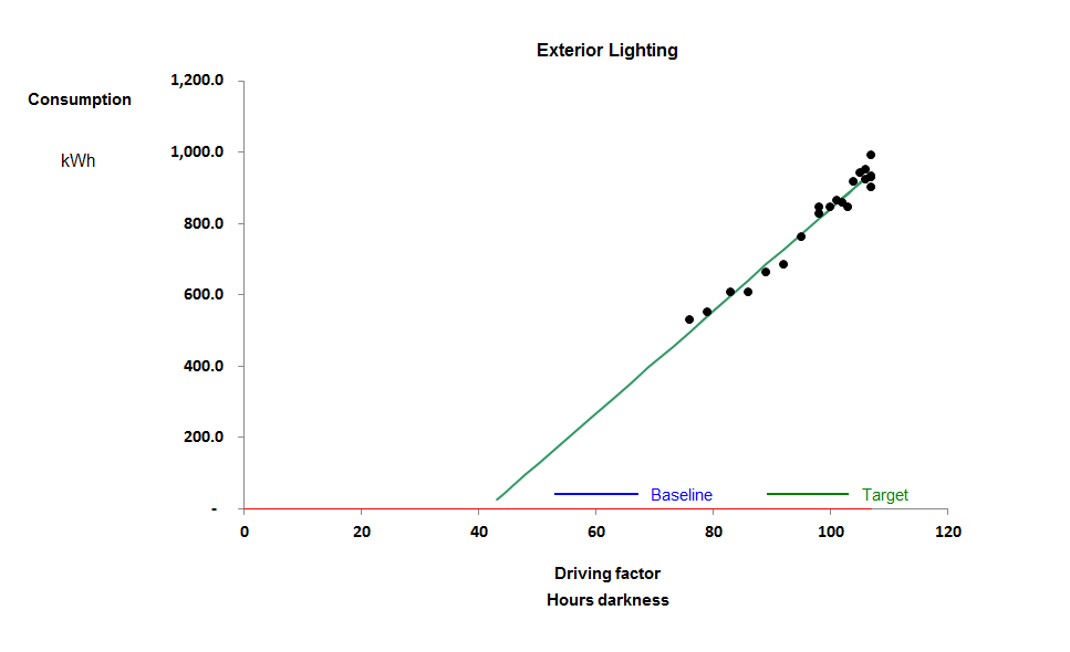
I began monitoring this external lighting circuit at a retail park in the autumn of 2016. It seems from the scatter diagram below that it exhibits weekly consumption which is well-correlated with changing daylight availability expressed as effective hours of darkness per week.

The only anomaly is the implied negative intercept, which I will return to later; when you view actual against expected consumption, as below, the relationship seems perfectly rational:


Consumption follows the annual sinusoidal profile that you might expect.

But what about that negative intercept? The model appears to predict close to zero consumption in the summer weeks, when there would still be roughly six hours a night of darkness. One explanation could be that the lights are actually habitually turned off in the middle of the night for six hours when there is no activity. That is entirely plausible, and it is a regime that does apply in some places, but not here. For evidence see the ‘heatmap’ view of half-hourly consumption from September to mid November:


As you can see, lighting is only off during hours of daylight; note by the way how the duration of daylight gradually diminishes as winter draws on. But the other very clear feature is the difference before and after 26 October when the overnight power level abruptly increased. When I questioned that change, the explanation was rather simple: they had turned on the Christmas lights (you can even see they tested them mid-morning as well on the day of the turn-on).

So that means we must disregard that week and subsequent ones when setting our target for basic external lighting consumption. This puts a different complexion on our regression analysis. If we use only the first four weeks’ data we get the relationship shown with a red line:

In this modified version, the negative intercept is much less marked and the data-points at the top right-hand end of the scatter are anomalous because they include Christmas lighting. There are, in effect, two behaviours here.

The critical lesson we must draw is that regression analysis is just a statistical guess at what is happening: you must moderate the analysis by taking into account any engineering insights that you may have about the case you are analysing


Lego shows why built form affects energy performance

Just to illustrate why building energy performance indicators can’t really be expected to work. Here we have four buildings with identical volumes and floor areas (same set of Lego blocks) but just look at the different amount of external wall, roof and ground-floor perimeter – even exposed soffit in two of them.

But all is not lost: there are techniques we can use to benchmark dissimilar buildings, in some cases leveraging submeters and automatic meter reading, but also using good old-fashioned whole-building weekly manual meter readings if that’s all we have. Join me for my lunchtime lecture on 23 February to find out more

Advanced benchmarking of building heating systems

The traditional way to compare buildings’ fuel consumptions is to use annual kWh per square metre. When they are in the same city, evaluated over the same interval, and just being compared with each other, there is no need for any normalisation. So it was with “Office S” and “Office T” which I recently evaluated. I found that Office S uses 65 kWh per square metre and Office T nearly double that. Part of the difference is that Office T is an older building; and it is open all day Saturday and Sunday morning, not just five days a week. But desktop analysis of consumption patterns showed that Office T also has considerable scope to reduce its demand through improved control settings.

Two techniques were used for the comparison. The first is to look at the relationship between weekly gas consumption and the weather (expressed as heating degree days).

The chart on the right shows the characteristic for Office S. Although not a perfect correlation, it exhibits a rational relationship.

Office T, by contrast, has a quite anomalous relationship which actually looked like two different behaviours, one high one during the heating season and another in milder weather.

The difference in the way the two heating systems behave can be seen by examining their half-hourly consumption patterns. These are shown below using ‘heat map’ visualisations for the period 3 September to 10 November, i.e., spanning the transition from summer to winter weather. In an energy heatmap each vertical stripe is one day, midnight to midnight GMT from top to bottom and each cell represents half an hour. First Office S. You can see its daytime load progressively becoming heavier as the heating season progresses:

Compare Office T, below. It has some low background consumption (for hot water) but note how, after its heating system is brought into service at about 09:00 on 3 October, it abruptly starts using fuel at similar levels every day:

Office T displays classic signs of mild-weather overheating, symptomatic of faulty heating control. It was no surprise to find that its heating system uses radiators with weather compensation and no local thermostatic control. In all likelihood the compensation slope has been set too shallow – a common and easily-rectified failing.

By the way, although it does not represent major energy waste, note how the hot water system evidently comes on at 3 in the morning and runs until after midnight seven days a week.

This case history showcases two of the advanced benchmarking techniques that will be covered in my lunchtime lecture in Birmingham on 23 February 2017 (click here for more details).

Air-compressor benchmarking

In energy-intensive manufacturing processes there is a need to benchmark production units against each other and against yardstick figures. Conventional wisdom has it that you should compare specific energy ratios (SER), of which kWh per gross tonne is one common example. It seems simple and obvious but, as anybody will know who has tried it, it does not really work because a simple SER varies with output, and this clouds the picture.

To illustrate the problem and to suggest a solution, this article picks some of the highlights from a pilot exercise to benchmark air compressors. These are the perfect thing for the purpose not least because they are universally used and obey fairly straightforward physical laws. Furthermore, because they are all making a similar product from the same raw material, they should in principle be highly comparable with each other.

Various conventions are used for expressing compressors’ SERs but I will use kWh per cubic metre of free air. From the literature on the subject you might expect a given compressor’s SER to fall in the range 0.09 to 0.14 kWh/m3 (typically). Lower SER values are taken to represent better performance.

The drawback of the SER approach is that some compressor installations, like any energy-intensive process, have a certain fixed standing load independent of output. The compressor installation in Figure 1 has a standing load of 161 kWh per day for example, and this has a distorting effect: if you divide kWh by output at an output of 9,000 m3 you should find the SER is just under 0.12 kWh/m3 but at a low daily output, say 4,000 m3 , you get 0.14 kWh/m3. The fixed consumption makes performance look more variable than it really is and changes in throughput change the SER whereas in reality, with a small number of obvious exceptions, the performance of this particular compressor looks quite consistent.
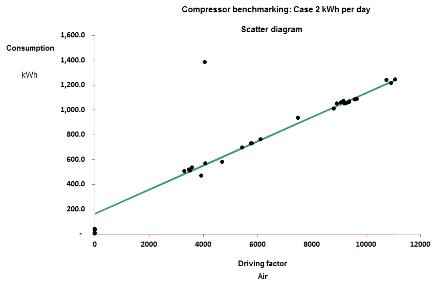
Figure 1

When I say it looks consistent I mean that consumption has a consistent straight-line relationship with output. The gradient of the best-fit straight line does not change across the normal operating range: it is said to be a ‘parameter’. In parametric benchmarking we compare compressors’ marginal SERs, that is, the gradients of their energy-versus-output scatter diagrams. The other parameter that we might be interested in is the standing load, i.e., where the diagonal characteristic crosses the vertical (kWh) axis.

The compressor installation in Figure 1 is one of eight that I compared in a pilot study whose results were as follows:

============================
Case   Marginal  Standing 
No     SER       kWh per day
----------------------------
 8      0.085       115 
 5      0.090        62 
 1      0.092     3,062 
 2      0.097       161 
 7      0.105        58 
 6      0.124        79 
 3      0.161       698 
============================

As you can see, the marginal SERs are mainly fairly comparable and may prove to be more so once we have taken proper account of inlet temperatures and delivery pressures. But their standing kWh per day are wildly different. It makes little sense to try comparing the standing loads. In part they are a function of the scale of the installation (Case 1 is huge) but also the metering may be such that unrelated constant-ish loads are contributing to the total. The variation in energy with variation in output is the key comparator.

In order to conduct this kind of analysis, one needs frequent meter readings, and the installations in the pilot study were analysed using either daily or weekly figures (although some participants provided minute-by-minute records). Rich data like this can be filtered using cusum analysis to identify inconsistencies, so for example in Case 3, although there is no space to go into the specific here, we found that performance tended to change dramatically from time to time and the marginal SER quoted in the table is the best that was consistently achieved.

Case 7 was found to toggle between two different characteristics depending on its loading: see Figure 2. At higher outputs its marginal SER rose to 0.134 kWh/m3, reflecting the relatively worse performance of the compressors brought into service to match higher loads.
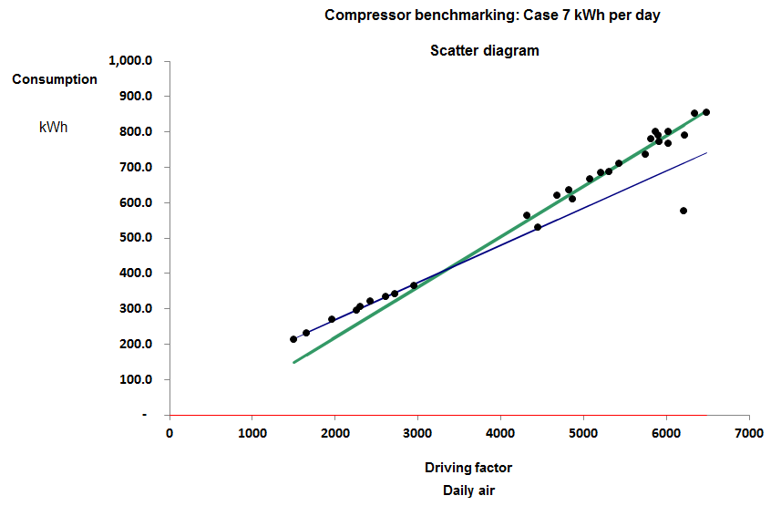
Figure 2

In Case 8, meanwhile, the compressor plant changed performance abruptly at the start of June, 2016. Figure 3 compares performance in May with that on working days in June and we obtained the following explanation. The plant consists of three compressors. No.1 is a 37 kW variable-speed machine which takes the lead while Nos 2 and 3 are identical fixed-speed machines also of 37 kW rating. Normally, No.2 takes the load when demand is high but during June they had to use No.3 instead and the result was a fixed additional consumption of 130 kWh per day. The only plausible explanation is that No. 3 leaks 63 m3 per day before the meter, quite possibly internally because of defective seals or non-return vales. Enquiries with the owner revealed that they had indeed been skimping on maintenance and they have now had a quote to have the machines overhauled with an efficiency guarantee.
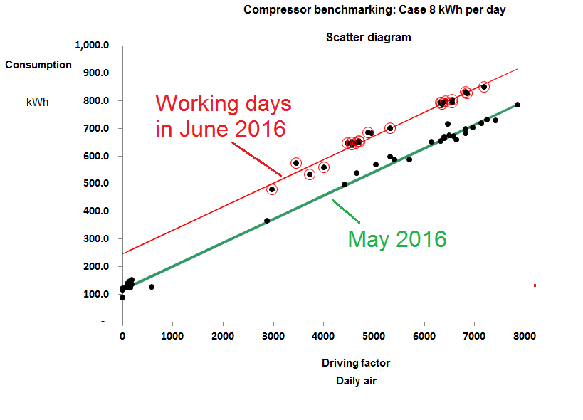
Figure 3

This last case is one of three where we found variations in performance through time on a given installation and were able to isolate the period of best performance. It improves a benchmarking exercise if one can focus on best achievable, rather than average, performance; this is impossible with the traditional SER approach, as is the elimination of rogue data. Nearly all the pilot cases were found to include clear outliers which would have contaminated a simple SER.

Deliberately excluding fixed overhead consumption from the analysis has two significant benefits:

  • It enables us to compare installations of vastly differing sizes, and
  • it means we can tolerate unrelated equipment sharing the meter as long as its contribution to demand is reasonably constant.

Meaningless claims

MEANINGLESS CLAIMS No. 9,461

Seen in a product brochure for a control system: “The theory states that if you allow the indoor temp to vary by 8ºC in a commercial or public building the heat saving will be 80%. In practice a span of 3-4ºC is usually more realistic (20-24ºC is common) resulting in heat savings of 20-40%. The use of a temperature range does not mean that the indoor temperature will change 3-4ºC over 24h, the average change in indoor temp over 24h is less than 1ºC, which is enough to utilise thermal storage. If no range is allowed, none of the excess free or purchased energy can be stored in the building.”

MEANINGLESS CLAIMS No. 9,462

I recently reported the new fashion for describing boiler-water additives as ‘organic’ to make them sound benign. As I pointed out, cyanide is an organic compound. Now here’s a new twist: a report on the efficacy of a certain boiler water additive says “[it] is 100% organic so the embodied carbon is 0.58kg of CO2 per bottle”. Er… How do they figure that?

MEANINGLESS CLAIMS No. 9,463

The same report cited another which said that a certain programme of domestic energy-conservation refits had yielded “up to a 42% increase in living room temperature”. Cold comfort indeed if your room started at zero degrees Celsius; 42% of zero is zero. Oh wait: what if you had used Fahrenheit, where freezing point is 32°F? A 42% increase on 32°F gives you 45.4°F (7.5°C). So it depends what temperature scale you use, and the truth is you can only talk about a percentage increase in temperature relative to absolute zero (-273°C). If we start at an absolute 273K (0°C), a 42% increase takes us to 388K or 115°C. To be honest, that doesn’t sound too comfortable either.

Refrigeration nonsense

The vapour-compression cycle at the heart of most air-conditioning systems consists of a closed loop of volatile fluid. In the diagram below the  fluid in vapour form at (1) is compressed, which raises its temperature (2), after which it passes through a heat exchanger (the “condenser”) where it is cooled by water or ambient air. At (3) it reaches its dewpoint temperature and condenses, changing back to liquid (4). The liquid passes through an expansion valve. The abrupt drop in pressure causes a drop of temperature as some of the fluid turns to vapour: the resulting cold liquid/vapour mixture passes through a heat exchanger (the “evaporator”) picking up heat from the space and turning back to vapour (1).

normal_loop
Figure 1: the vapour-compression refrigeration cycle schematically and on a temperature-entropy diagram

The condenser has two jobs to do. It needs to dump latent heat (3->4) but first it must dump sensible heat just to reduce the vapour’s temperature to its dewpoint. This is referred to as removing superheat.

It has been claimed that it is possible to improve the efficiency of this process by injecting heat between the compressor and condenser (for example by using a solar panel). Could this work?

solar_loop_true
Figure 2: showing the effect of injecting heat

The claim is based on the idea that injecting heat reduces the power drawn by the compressor. It is an interesting claim because it contains a grain of truth, but there is a catch: the drop in power would be inextricably linked to a drop in the cooling capacity of the apparatus. This is because we have now superheated the vapour even more than before, so the condenser now needs to dump more sensible heat. This reduces its capacity to dump latent heat. The evaporator can only absorb as much latent heat as the condenser can reject: if the latter is reduced, so is the former. Any observed reduction in compressor power is the consequence of the cooling capacity being constrained.

The final nail in the coffin of this idea is that reduced power is not the same as reduced energy consumption: the compressor will need to run for longer to pump out the same amount of heat. Thus there is no kWh saving, whatever the testimonials may say.

View a vendor’s response