All posts by Editor

Magnets: mutual repulsion

One ironic and highly satisfying way to debunk the claims for magnetic fuel conditioning is to pitch one supplier against another. I have been digging in the archive for claims made by different suppliers, and with assistance from eagle-eyed newsletter reader Mark J., have compiled the following account. Let’s start with Magnatech. Their web site makes a bald assertion that passing fuel through a magnet’s negative and positive (sic) fields makes it easier for the fuel to bond with oxygen and burn. They offer no explanation of how this works but say it creates a rise in flame temperature of “an extra 120°C or more”.  However, their competitor Maximus Green says that the flame temperature only rises by 20°C, but they gamely have a crack at explaining how: they claim that hydrocarbon fuel molecules clump together in large “associations” because they are randomly charged positive and negative (although even if that were true, wouldn’t they just pair up?). Passing through a magnetic field, they say, gives all the molecules a positive charge, breaking up these supposed big clusters of fuel molecules. They don’t say where all the resulting spare electrons go.

Or at least that’s what Maximus Green used to say. In a recent (unsuccessful) submission to the Advertising Standards Authority they offered a completely different story. Quoted in the ASA ruling they said that “the hydrogen and carbon compound of gas and oil had two distinct isometric (sic) forms – ‘Ortho-state’ and ‘Para-state’ – which were characterised by different, opposite nucleus spins. The Ortho-state was more unstable and reactive in comparison to the Para-state, and therefore that state was desired because it resulted in a higher rate of combustion. They said that when fuel passed through the magnetic field the hydrocarbon molecule changed from the para-hydrogen state to the ortho-hydrogen state, and that the higher energised spin state of the ortho-hydrogen molecules produced high electrical potential (reactivity), which attracted additional oxygen and therefore increased combustion efficiency”.

Another player, Maxsys, meanwhile, are having none of this ionised oil, lumpy gas or nuclear spin stuff. Their 2014 brochure lays the blame on very fine dust in the fuel. By applying a magnetic field, they say “nanoparticles that would normally pass through the combustion or reduce heat transfer efficiency, by clinging to and fouling surfaces, begin to cluster together”, an effect which forms “larger colloids, less likely to create a film deposit and compromise a plant’s performance”. Now pardon my scientific knowledge, but a “colloid” is a stable suspension of very fine particles in a liquid. Milk is a good example. Be that as it may, Maxsys are saying that magnetic fields cause things to clump together, in direct contradiction to what we heard earlier from Maximus Green in one of their versions of how magnetism supposedly works.

Someone is telling porkies and I will leave it to you, dear reader, to work out who.

Footnote: an independent test of the efficacy of magnets on fuel lines was carried out by Exeter University in 1997. Their report, which strangely is never quoted by vendors, can be downloaded here.

Data centres and ISO 50001

Certification to ISO50001 can yield benefits but would be fatally compromised if a misleading energy performance indicator is used to track progress.

Power Utilisation Effectiveness, PUE, is the data-centre industry’s common way of reporting energy performance, but it does not work. It is distorted by weather conditions and (worse still) gives perverse results if users improve the energy efficiency of the IT equipment housed in a centre through (for example) virtualisation.

This presentation given at Data Centres North in May 2018 explains the problem and shows how a corrected PUE should be computed.

Pants on Fire Award

And the winner of the Pants on Fire Award is… DB2 Management OÜ who sell a product called ‘Ecovolt’. This device, which plugs into a standard 13A wall socket, is claimed to cut 30-50% off your electricity consumption. What makes it a stand-out candidate for the Pants on Fire Award is the advertisers’ invocation of conspiracy theory::Their web site includes a short video purporting to prove the device’s energy-saving effect. It shows a pair of electric hair clippers on an extension adaptor drawing 0.28 A. When the Ecovolt device is plugged into a neighbouring socket, the current falls to 0.08 A. Electrical engineers will recognise this as an example of power-factor correction and nothing to do with reducing the real power drawn by the appliance; like the EPS Energy Saver which I reported on a couple of years ago (pictured below), the Ecovolt probably contains a big capacitor and not much else.

The visitor to the web site sees continual pop-up notices saying that Tatiana, Sara, or Phillip and so on have just ordered Ecovolt. Keep your eye on those alerts for more than 70 seconds and Tatiana, Sara and Phillip appear again followed by six other repeated names. That’s the kind of loyal customer we all want.

The firm operates out of a Post Office Box in Tallinn, Estonia, and sells a diverse product range including night driving glasses, dash cams, and non-stick frying pans. I ought also to mention that Ecovolt is someone else’s trade mark.


Universal energy-saving product

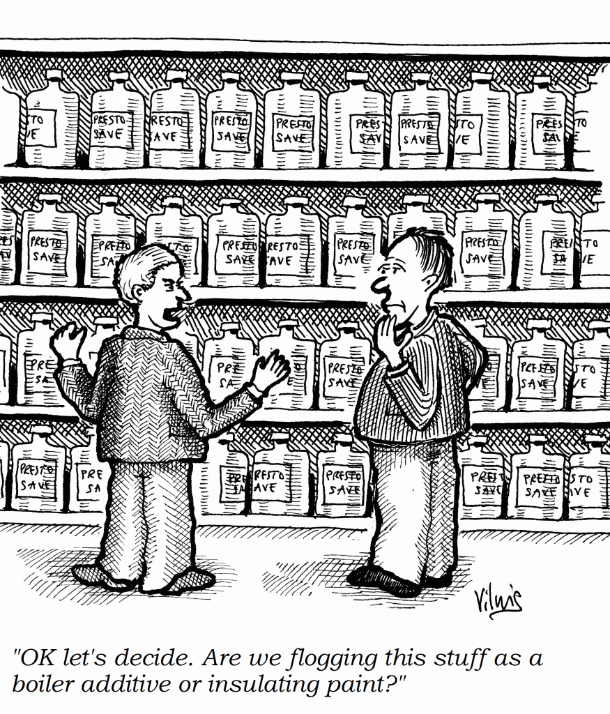
DATELINE 1 APRIL 2018: we bring you news of the first ever universal energy-saving product. It is a multi-award-winning patented gel, discovered by an ex-NASA scientist, which boasts a unique combination of nano-magnetic and photo-piezo-electric properties.

Used as an additive in heating-system water it has a triple action. Firstly by reducing surface tension, it improves thermal contact between the water and internal heat transfer surfaces. As a result radiators heat up faster and cool down more slowly, saving energy. Secondly it removes air (improving thermal contact between the water and internal heat transfer surfaces). Removing air means less corrosion and scaling, while its nano-magnetic properties repel any residual magnetite. As a result radiators heat up faster and cool down more slowly, saving energy. Finally it fills in the gaps between water molecules, improving thermal contact between the water and internal heat transfer surfaces. As a result radiators heat up faster and cool down more slowly, saving energy.

The product can also be applied to radiators externally as a paint which promotes heat transfer through far infra-red radiation. As a result rooms heat up faster and cool down more slowly, saving energy.

Another way to use it is as a wall paint. Used externally, its embedded nano-scale vacuum bubbles allow it to act as a superinsulator: just 0.25mm thickness is the equivalent of 7cm thick conventional cavity fill or exterior wall insulation. As an internal paint applied to the wall behind a heating radiator it reflects wasted heat back into the room, which then heats up faster and cools down more slowly, saving energy. The gel changes to a solid at exactly your preferred room temperature, absorbing or releasing latent heat. As a result of this ‘phase change’ action, when applied as an undercoat for interior wall paint or as a wallpaper adhesive, the room will heat up faster and cool down more slowly while maintaining a steady temperature, saving energy.

It can even be used for painting windows, where its photo-electric properties allow it to generate free energy from the sun without loss of light transmission into the room, and as a floor paint its piezo-electric properties mean it can capture energy from passing pedestrians, generating enough power.

It has benefits in plant rooms and substations, too. As a coating on gas or oil supply pipes, its nano-magnetic effect yields all the benefits of the different types of awkward and bulky bolt-on magnetic devices. For example by rearranging the ortho- and para-hydrogen molecules it promotes more complete and rapid combustion. It also aligns the fuel molecules and makes them more reactive, which promotes more complete and rapid combustion. In the case of oil fuels this calorific value enhancement (CVE) can be further increased by adding the product to the fuel itself, where it alters a previously-undiscovered property of the oil to make its molecules more reactive, which promotes more complete and rapid combustion.

The gel is non-Newtonian, so its action does not have any equal and opposite reaction, making it an ideal lubricant to reduce energy losses in gearboxes.

On electrical systems the product can be applied to the outer insulation of supply cables where its nano-magnetic properties will optimise the voltage without the need for transformers or other lossy electrical devices. Moreover, it has the effect of counteracting the random ‘Brownian motion’ of the free electrons in the conductors so that they move in a more orderly manner through your electrical equipment, improving its efficiency by up to several percent.

As a refrigerant additive, it modifies a previously-unknown property of the refrigerant fluid, causing it to absorb heat faster and release it more slowly, saving energy, and when applied to the thermostat sensor of a freezer it shields it from the effects of changing temperature, reducing the operation of the refrigeration compressor and saving energy.

Prove you’re green: buy Trumputine.

Pie charts


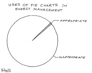
In his highly-recommended book Information dashboard design, data-presentation guru Stephen Few criticises pie charts as being a poor way to present numerical data and I quite strongly agree. Although they seem to be a good way to compare relative quantities, they have real limitations especially when there are more than about five categories to compare. A horizontal bar chart is nearly always going to be a better choice because

  1. there is always space to put a label against each item;
  2. you can accommodate more categories;
  3. relative values are easier to judge;
  4. you can rank entries for greater clarity;
  5. it will take less space while being more legible; and
  6. you don’t need to rely on colour coding (meaning colours can be used to emphasise particular items if needed).

Pie charts with numerous categories and a colour-coded key can be incredibly difficult to interpret, even for readers with perfect colour perception, and bad luck if you ever have to distribute black-and-white photocopies of them.


Data presentation is one of the topics I cover in my advanced M&T master classes. For forthcoming dates click here


Common weaknesses in M&T software

ONE OF MY GREAT FRUSTRATIONS when training people in the analysis and presentation of energy consumption data is that there are very few commercial software products that do the job sufficiently well to deserve recommendation. If any developers out there are interested, these are some of the things you’re typically getting wrong:

1. Passive cusum charts: energy M&T software usually includes cusum charting because it is widely recognised as a desirable feature. The majority of products, however, fail to exploit cusum’s potential as a diagnostic aid, and treat it as nothing more than a passive reporting tool. What could you do better? The key thing is to let the user interactively select segments of the cusum history for analysis. This allows them, for example, to pick periods of sustained favourable performance in order to set ‘tough but achievable’ performance targets; or to diagnose behaviour during abnormal periods. Being able to identify the timing, magnitude and nature of an adverse change in performance as part of a desktop analysis is a powerful facility that good M&T software should provide.

2. Dumb exception criteria: if your M&T software flags exceptions based on a global percentage threshold, it is underpowered in two respects. For one thing the cost of a given percentage deviation crucially depends on the size of the underlying consumption and the unit price of the commodity in question. Too many users are seeing a clutter of alerts about what are actually trivial overspends.

Secondly, different percentages are appropriate in different cases. Fixed-percentage thresholds are weak because they are arbitrary: set the limit too low, and you clutter your exception reports with alerts which are in reality just normal random variations. Set the threshold too high, and solvable problems slip unchallenged under the radar. The answer is to set a separate threshold individually for each consumption stream. It sounds like a lot of work, but it isn’t; it should be be easy to build the required statistical analysis into the software.

3. Precedent-based targets: just comparing current consumption with past periods is a weak method. Not only is it based on the false premise that prevailing conditions will have been the same; if the users happens to suffer an incident that wastes energy, it creates a licence to do the same a year later. There are fundamentally better ways to compute comparison values, based on known relationships between consumption and relevant driving factors.

Tip: if your software does not treat degree-day figures, production statistics etc as equal to consumption data in importance, you have a fundamental problem

4. Showing you everything: sometimes the reporting philosophy seems to be “we’ve collected all this data so we’d better prove it”, and the software makes no attempt to filter or prioritise the information it handles. A few simple rules are worth following.

  1. Your first line of defence can be a weekly exception report (daily if you are super-keen);
  2. The exception report should prioritise incidents by the cost of the deviations from expected consumption;
  3. It should filter out or de-emphasise those that fall within their customary bounds of variability;
  4. Only in significant and exceptional cases should it be necessary to examine detailed records.

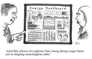
5. Bells and whistles: presumably in order to give salesmen something to wow prospective customers, M&T software commonly employs gratuitous animation, 3-D effects, superfluous colour and tricksy elements like speedometer dials. Ridiculously cluttered ‘dashboards’ are the order of the day.

Tip: please, please read Stephen Few’s book “Information dashboard design”


Current details of my courses and masterclasses on monitoring and targeting can be found here

Energy monitoring of multi-modal objects

Background: conventional energy monitoring

In classic monitoring and targeting practice, consumption is logged at regular intervals along with relevant associated driving factors and a formula is derived which computes expected consumption from those factors. A common example would be expected fuel consumption for space heating, calculated from measured local degree-day values via a simple straight-line relationship whereby expected consumption equals a certain fixed amount per week plus so many kWh per degree-day. Using this simple mathematical model, weekly actual consumptions can then be judged against expected values to reveal divergence from efficient operation regardless of weather variations. The same principle applies in energy-intensive manufacturing, external lighting, air compressors, vehicles and any other situation where variation in consumption is driven by variation in one or more independently measurable factors. The expected-consumption models may be simple or complex.

Comparing actual and expected consumptions through time gives us valuable graphical views such as control charts and cusum charts. These of course rely on the data being sequential, i.e., in the correct chronological sequence, but they do not necessarily need the data to be consecutive. That is to say, it is permissible to have gaps, for instance to skip invalid or missing measurements.

The Brigadoon method

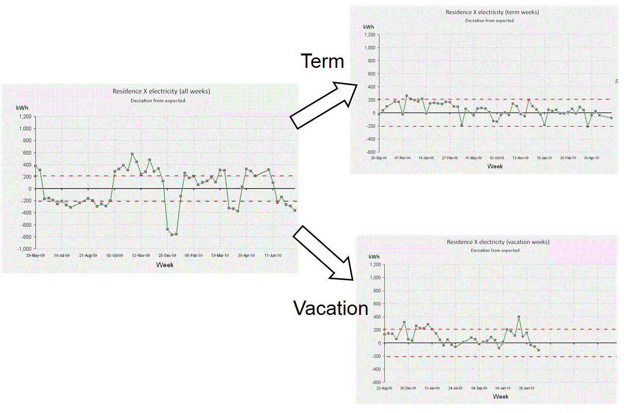
“Brigadoon” is a 1940s Broadway musical about a mythical Highland village that appears in the real world for only one day a year (although as far as its inhabitants are concerned time is continuous) and its plot concerns two tourists who happen upon this remote spot on the day that the village is there. The story came to mind some years ago when I was struggling to deal with energy monitoring of student residences. Weekly fuel consumption naturally dropped during vacations (or should do) and I realised I would need two different expected-consumption models, one for occupied weeks and another for unoccupied weeks using degree-days computed to a lower base temperature. One way to accommodate this was to have a single more complex model that took the term/vacation state into account. In the event I opted for splitting the data history into two: one for term weeks, and the other for vacation weeks. Each history thus had very long gaps in it, but there is no objection to closing up the gaps so that in effect the last week of each term is immediately followed by the first week of the next and likewise for vacations.

This strategy made the single building into two different ones. Somewhat like Brigadoon, the ‘vacant’ manifestation of the building for instance only comes into existence outside term time, but it appears to have a continuous history. The diagram below shows the control chart using a single degree-day model on the left, as per conventional practice, while on the right we see the separate control charts for the two virtual buildings, plotted with the same limits to show the reduction in modelling error.

Not just space heating

This principle can be used in many situations. I have used it very successfully on distillation columns in a chemical works to eliminate non-steady-state operation. I recommended it for a dairy processing plant with automatic meter reading where the night shift only does cleaning while the day shift does production: the meters can be read at shift change to give separate ‘active’ and ‘cleaning’ histories for every week. A friend recently asked me to look at data collected from a number of kilns with batch firing times extending over days, processing different products; here it will be possible to split the histories by firing programme: one history for programme 20, another for 13, and so on.